Timeline
I’m a nut for music. Not much into clubbing. But if I were to head out to a lounge for an event, it would be for an ‘Old School Jam’. That’s an event where the DJ plays music from previous decades and people are there just for that. [quote float=”left”]A throwback to a better and perhaps purer time [/quote] They aren’t there for the sake of getting drunk or picking up chicks. In fact, it’s not uncommon at these events to see groups of guys dancing in a swarm, celebrating each song that gets played, as it takes them all back to their childhood or teens. And that is the essence of why these events happen and are so popular – nostalgia. A throwback to a better and perhaps purer time musically and in their life – short on problems, tall on fun. I also DJ from time to time, with 90’s R&B being my specialty. It was what I was drawn to growing up, and I have distinct memories of hearing those songs on the AM radio (not exactly as in my childhood) on my bedside table, from which I would record to cassette tapes. These events are filled with people who did the very same things growing up.
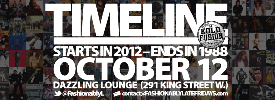
I recently designed the monthly flyer for such an event called Timeline. The event was going to take a different musical approach than most Old School Jams. For Timeline, the DJ starts in 2012 and goes backwards all the way to 1988. This was my design approach:
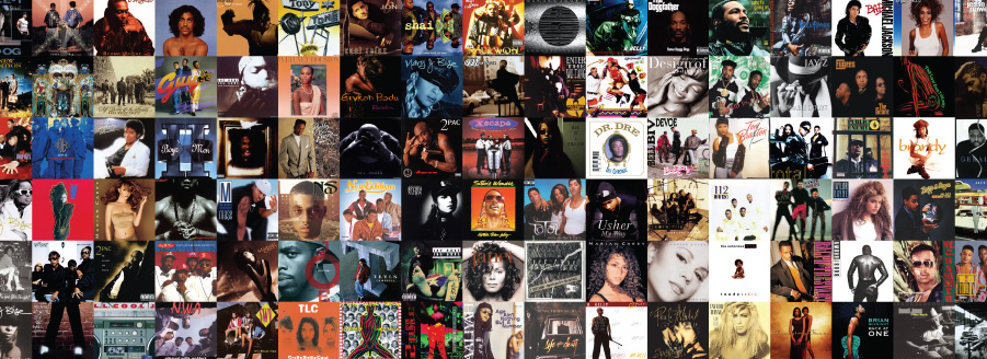
[quote float=”right”]Nearly 100 covers later, I had a grid of music past laid out[/quote] The client had requested a design similar to what they had had a few years earlier that took advantage of old, but familiar album art. So, with this needing to be a quick job, I began gathering all the album art from those times that I could think of hearing growing up. Amazon.com got a lot of traffic from me that afternoon. Nearly 100 covers later, I had a grid of music past laid out in Adobe InDesign, as a suitable background for what I had envisioned in my head. I used InDesign for this step because I figured with all the ‘placing’ I was going to be doing on a grid of same-sized squares, it would be faster and easier to work with. I was pleased with that decision during and after the process. 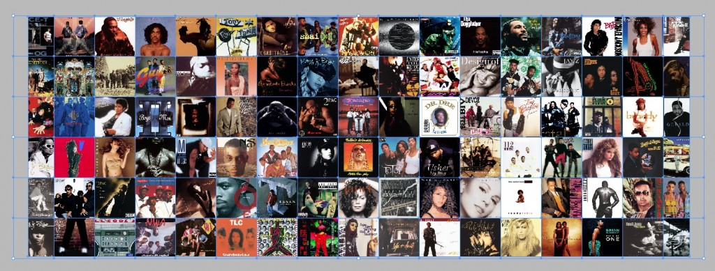 From there, I exported the grid of albums to a PDF (Portable Document Format), which gave me the foundation for my upcoming steps in Photoshop.
[quote float=”right”]nice and tight but still legible.[/quote]The next step was to create the text for the flyer. I had an idea of what I wanted the text to look like. I wanted it to be pretty blocky and very bold. I tinkered a bit in InDesign, but with the amount of adjusting I was doing to individual lines and words, I thought it best to be handled in Illustrator where I wouldn’t have to be constantly resizing frames. I put all the text that needed to included on the flyer on the Artboard and then determined the hierarchy of information which I created mainly with size, as you can see. I used Myriad Black for the text throughout. Many adjustments to both the tracking and kerning were made to get the text nice and tight but still legible. The Twitter icon at the bottom was found online (search “vector social media icons”, or something more specific), and the envelope icon was something I quickly drew up in Illustrator for another client’s business card. For the sake of this example, I put a grey background behind the text so you could see it. The file itself is an EPS (Encapsulated Post Script) with just the white text and no background. 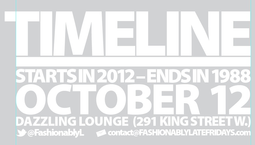
In Photoshop, I created a new document and placed the album grid down first. Then I placed the text EPS I created in Illustrator, and scaled it to fit appropriately. It was clear immediately that because of the kaleidoscope of albums behind the text, including many light-coloured ones, some of the text was labouring to be clear. So I laid down a solid black layer between the grid layer and the text layer and adjusted the transparency until there was a friendly medium between a strong contrasting text and still recognizable album covers. I added the DJ’s logo overtop of the text within Photoshop and I was done.
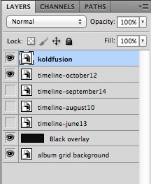
For subsequent months, I adjusted the text in the Illustrator EPS and saved it using the month as a filename. Then placed it into Photoshop as a new layer and turned off the visibility of the previous month’s layer. From within Photoshop, I would export it to its primary usage, which was to be a slider image for the promotion’s website.
[quote float=”left”]it can always be adjusted to be suitable for print, which is a great option to have.[/quote] The current Photoshop file is setup to be the web slider’s dimensions at 150 dpi, allowing it to be optimized down (to 72 dpi) from a higher place instead of dropping down from where it needs to end up. The beauty of the way I created things is that it can always be adjusted to be suitable for print, which is a great option to have. I wasn’t sure if this flyer would ever go to print or not, but if it was supposed to, I could resize the canvas within Photoshop and resize it all as the album grid was a print-worthy PDF that had greater dimensions than I would need, and the text EPS created in Illustrator is still in vector format.
How often do you use the Adobe trifecta on a single-page piece? Is there a more efficient way to have gotten the desired results? What did you think of this process?

